For my first task of this module, I had the choice of developing either a character or environmental concept. Out of the two options, I decided to make a character since I found it more approachable.
I wanted to make a character inspired by the game, Cuphead as the art style the game uses was appealing when I first played the game. I especially liked the theme of practices in a cartoon that in some more than most mirror reality such as gambling, alcohol and debt. Though I wanted to create something that follows the theme the game uses, I wanted to do something simple.
The character I created was also inspired by my personal fascination of in-world casinos and gambling. So I decided to make a enemy for a Run ‘n Gun level that has the body of a casino chip used in games like Blackjack and Poker.
The Design Process
During the time of designing my character, I wasn’t too confident in using Adobe Photoshop to make digital art so I drew my character first in my sketchbook and traced it using Krita and the aforementioned Adobe Photoshop.
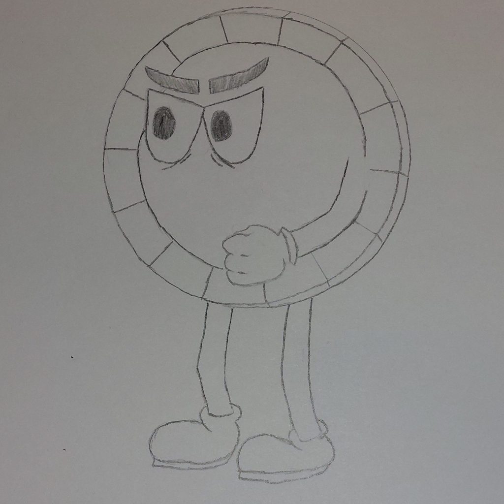
After a while of sketching I developed my design on paper… well as much as I needed for to trace it using software.
I uploaded a picture of the sketch on my computer and opened it on Krita, then created a new layer to go over the image. I sketched out the outline of the drawing and added his right arm onto the design. I included colour and shading to areas it was needed such as the outer rim of the body, as well as some tweaking to the eyes to make the character fit in better with the Cuphead enemies encountered by the player within the game.
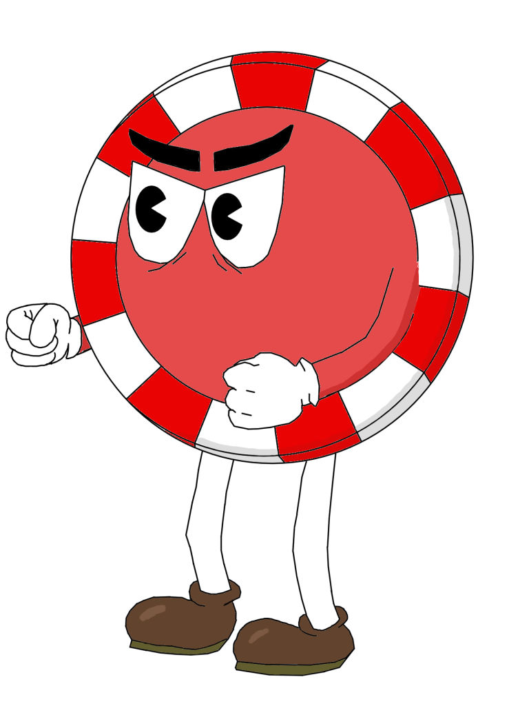
I made a few mistakes with the character design such as incorrectly shape theory for the body and the aesthetics of the left glove. Because of this I imported the character to Photoshop since I felt more confident using the software after getting more accustomed to it.
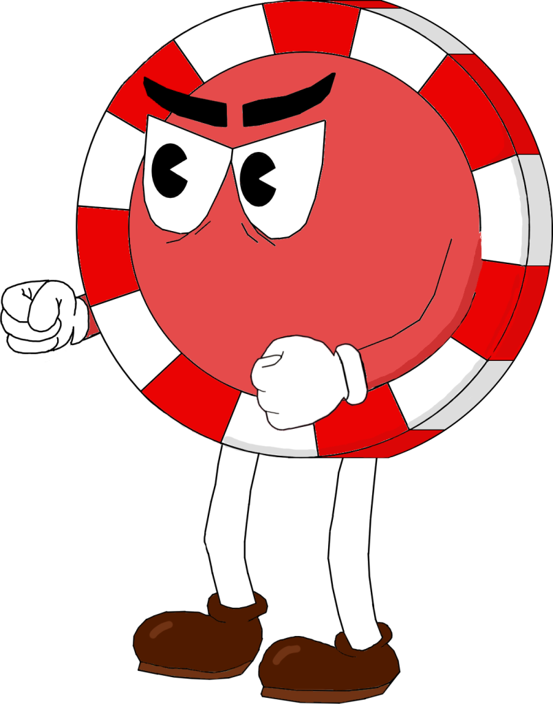
I first fixed the shape of the character’s body using the ellipse tool which gave a good outer curve. I then filled in any gaps on the black outlining of the image since that was an issue resulted by my difficult experience using Krita previously. I change the colour of the shoes to a dark brown to make the design more aesthetically pleasing and finally revamped the left glove, making it follow the cartoon art style more smoothly.
Pros and Cons…
One of the pros of this design is that it fits the theme of Cuphead which often has very colourful characters and follows the other enemies design features. Making the character seem like it would fit into the game world.
Another positive aspect is that proper shape theory was used to make the character design have depth which then makes the concept more aesthetically pleasing to the eyes.
One of the cons of the character concept is that there are a lot of areas the were made using the line tool in Krita which may make certain areas look sharp when they meant to be smooth such as the outline of the shoes, legs and arms.
The other con of this design is that I believe that the shoes colour is slightly too dark for the overall look I was trying to achieve, and could’ve been better with a lighter colour.